RSI and MACD: How the Indicators Work, and the Illusion of a “Signal”
Below the price chart there is usually a separate panel filled with winding lines. These are technical indicators such as RSI and MACD. They are presented as formulas that process price and volume in order to extract signals the eye cannot see on its own. The two most widely used of them are RSI and MACD, and they come pre-installed on almost every brokerage chart. This article sets out exactly what these indicators calculate, and uses real data to show how a widely repeated rule such as “buy at RSI 30, sell at RSI 70” falls apart in practice.
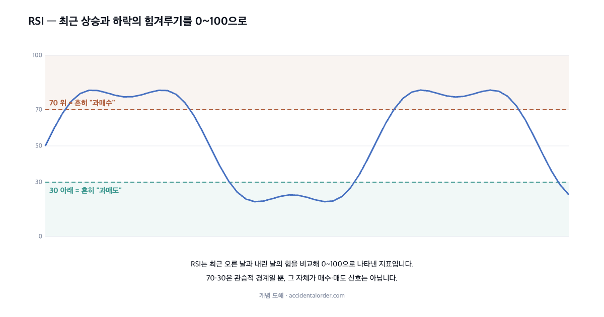
RSI — a tug of war between recent gains and losses
RSI (the Relative Strength Index) compares the size of the gains on up days with the size of the losses on down days over a recent window (usually 14 days), and expresses that balance of force as a number between 0 and 100. When the up days dominate, the value approaches 100; when the down days are stronger, it approaches 0. A reading of 50 means the two forces are evenly matched. In other words, RSI compresses the question “how strongly has recent price action leaned to the upside?” into a single number.
By convention, an RSI above 70 is called “overbought” and below 30 “oversold” — the interpretation being that the price has risen too fast and overheated, or fallen too fast and been sold off excessively. And this is where the famous rule comes from: “buy when oversold (below 30), sell when overbought (above 70).” Intuitively it sounds plausible. The question is whether the rule actually works.
Real data — Monami’s RSI betrayed the rule
Let us revisit the Monami episode of June–July 2026, which has appeared several times already, this time alongside its RSI. The upper panel is the share price, the lower one RSI(14).
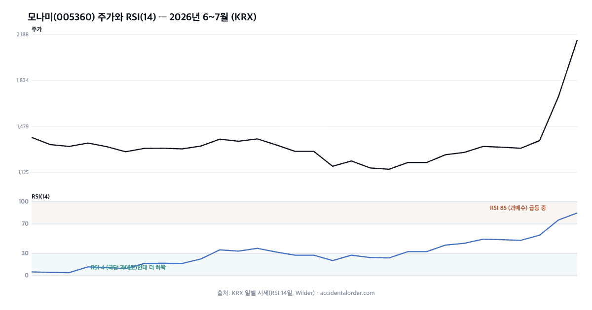
Followed literally, the rule would have dictated the following. In early June, with RSI down at 4 — an extreme oversold reading — “it is oversold, so buy.” Yet the price then fell further, down to KRW 1,148. Buying because it was oversold would only have deepened the loss. Conversely, on 10 July, with RSI spiking to 84.8 in overbought territory, “it is overbought, so sell.” But that was the very day the price leapt from KRW 1,369 to KRW 2,145 in a single session. Selling because it was overbought would have meant missing that surge entirely.
This is not a one-off coincidence. In a strong downtrend RSI stays oversold for a long stretch while the price keeps falling, and in a strong uptrend it stays overbought while the price keeps rising. Which is to say: the bigger the move, the more an extreme RSI reading becomes evidence of the trend rather than a signal against it. Betting the other way at extremes can therefore mean standing directly in front of the most powerful flow in the market.
What this article does not say
This article does not say “buy when RSI is below 30 and sell when it is above 70.” As the Monami case above shows, in a strong trend RSI can sit at an extreme while the price carries on in the same direction — falling further from oversold, rising further from overbought. Trading that mechanically follows simple RSI or MACD signals mostly fails, under rigorous testing and once transaction costs are counted, to deliver a stable excess return. RSI and MACD are tools that summarise recent price movement, not devices that tell you when to trade. Boundaries such as 70 and 30, or golden and dead crosses, are merely conventional tick marks.
One thing worth adding: the Monami case was so dramatic because the stock was in an unusual phase driven not by earnings but by sentiment — buying as a show of support. Even in a normal, earnings-led move RSI and MACD signals often miss, but in a phase governed by sentiment the betrayal is far more extreme. The sight of an indicator shouting “overbought” while the price rockets is a compressed demonstration of how powerless indicators are in the face of a gale of sentiment. In such phases especially, it is far safer to ask “how far has this price drifted from the value of the business?” than to lean on a single number.
MACD — the distance between two moving averages
MACD (Moving Average Convergence Divergence) does exactly what the name suggests: it looks at the relationship between two moving averages. Subtracting the long-term exponential moving average (usually 26 days) from the short-term one (12 days) gives the MACD line. A value above 0 means the short-term average sits above the long-term one (the upside has the upper hand); below 0 means the reverse. On top of this is drawn a signal line (9 days), which is simply an average of the MACD line itself.
MACD crossing above the signal line is commonly presented as a buy signal, and crossing below as a sell signal. But this is ultimately nothing more than a slightly different way of calculating the golden and dead crosses covered in the earlier article on moving averages. It therefore carries exactly the same limitations — because it is derived from moving averages it lags, it throws off frequent false signals in a sideways market, and it has no predictive power in itself.
How RSI is calculated
Understanding the concept precisely reduces misuse. RSI is calculated from the ratio (RS) between the average gain on up days and the average loss on down days over the past 14 days. The larger RS is — the stronger the upward force — the closer RSI moves to 100; the smaller it is, the closer to 0. The formula is 100 − 100÷(1+RS). One fact this calculation makes plain is that RSI looks at “the direction and force of recent change,” not at “the level of the price.”
RSI is therefore highly sensitive to how many days it is based on. A short window (say 9 days) swings sharply and produces extreme readings often; a long one (say 21 days) moves sluggishly. Even the commonly used 14 days is a convention rather than an absolute standard. The fact that the same stock can be judged “overbought” or “oversold” depending on the window chosen shows just how arbitrary these boundaries are.
The MACD histogram
Besides the two lines, a MACD chart also plots bars — the histogram. These bars represent the gap between the MACD line and the signal line. When the two lines diverge the bars grow longer; when they converge the bars shrink. So when the histogram starts to contract, some read it as an early signal that “the two lines are converging, meaning a cross is imminent.”
But this too is simply one more round of processing applied to the relationship between moving averages. The raw material is still nothing but price. Trading on fine-grained readings of histogram changes amounts to slicing the same price information ever more thinly. The thinner the slices, the more signals appear — and a good many of them are noise.
Markets where indicators fit, and markets where they do not
Technical indicators have a fundamental compatibility problem. An oscillator such as RSI — the overbought/oversold family — appears to work plausibly well in a sideways market where the price oscillates within a range, because it is capped above and supported below. But when a strong trend arrives it works in exactly the opposite way: the trend continues while the indicator sits pinned at overbought or oversold, and betting against it produces large losses.
Conversely, a trend-following indicator such as MACD tracks direction well in a strongly trending market but bleeds losses through frequent false signals in a sideways one. The trouble is that you cannot know in advance, in real time, whether you are in a sideways market or a trending one. So which indicator to trust, and when, is itself uncertain. This fundamental dilemma is why trading on a single indicator rarely works in a stable way.
Divergence — plausible, but handle with care
One concept that comes up often with technical indicators is divergence. If the price makes a new high while RSI or MACD fails to exceed its previous high (bearish divergence), it is read as a sign that upward force is weakening. The opposite case is bullish divergence. The logic itself is plausible enough — the story being that the surface is still rising while the internal momentum cools.
Yet divergence, too, is weak as a predictive tool. It is common for a trend to run on for a long while after divergence appears (hence the saying that “divergence can persist”), and while it looks obvious in hindsight, in real time it is indistinguishable from countless similar-looking shapes. Selective memory — remembering only the divergences that later proved right — makes this indicator look far more powerful than it is.
The shared limitations of technical indicators
RSI, MACD and countless other indicators share one thing in common: they are all different ways of processing a single raw material — price (and volume). Stacking several indicators on top of one another therefore does not multiply the information accordingly. Most of them are echoes of the same price data. “RSI is oversold, MACD has a golden cross, the stochastic is bouncing too” — several indicators may appear to agree, but in truth you may simply be hearing one piece of information repeated several times over.
These indicators are also calculated mostly from past prices, so they lag by their very nature. No indicator knows the future in advance. The honest way to treat them, then, is to see them not as prophecy but as pictures that summarise price from a different angle. Having more and more complex indicators does not raise predictive power; if anything, it makes it easier to stack the same illusion in several layers.
So what are RSI and MACD good for?
They are not useless. RSI shows at a glance how far the current price has leaned to one side within the recent flow, and MACD compresses the relationship between short-term and long-term movement onto a single screen. As summary tools for quickly grasping market conditions they are useful. You can tell at a glance, for instance, that “this stock has risen sharply of late (RSI is high).” The key, though, is to use them as a reference for reading context rather than as trading signals. What to buy is still judged from the business and the financials; the indicators come in only at the stage of executing that judgement.
Indicators and fundamentals
Whether RSI is oversold or MACD has produced a dead cross belongs to a different layer from the value of the company. If a business with solid foundations has been driven into oversold territory by market-wide fear, that may be an opportunity; if a company whose business is collapsing is oversold, there is a reason for it to fall further. Indicators only tell you “how fast it has moved”; whether “that price is cheap or expensive” is answered by the financial statements.
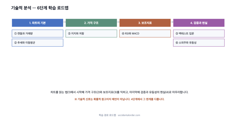
From this site’s perspective, then, the order is clear. What to buy is judged from the business and the financials, and RSI and MACD are used only as aids to understanding a stock’s current state. If the indicators shout buy but the business is poor, we do not buy; if the indicators point to overbought but the value is there, we do not sell in haste. The conclusion is the same as with moving averages, support and resistance — tools assist execution; they do not replace judgement.
A checklist for reading RSI and MACD
- What does the number calculate: RSI = the force of gains versus losses, MACD = the distance between moving averages.
- The boundaries are conventions: 70, 30 and crosses are tick marks, not signals.
- Trending versus sideways market: betting against an extreme reading in a strong trend is dangerous.
- Beware the echo: several indicators agreeing ≠ several pieces of evidence. Usually it is the same price data.
- Judgement comes from the financials: indicators are only aids to context and execution.
Why are technical indicators so popular?
There are reasons why indicators such as RSI and MACD are especially popular. First, the rules are simple. “Sell when it goes above 70” is easy to learn and unambiguous to carry out. Second, drawn as distinct lines on a chart, they give the feeling that “something scientific is being analysed here.” Third, applied to past charts they look as though they fit well. Combine these three and indicators create the illusion of being far more powerful than their actual predictive power warrants.
But the simpler and clearer a rule, the more rigorously one has to ask whether it really predicts the future or merely explains the past well. Enormous numbers of people are watching the same indicators, and if simple rules made money easily, that opportunity would already have disappeared. A signal everyone knows is unlikely to keep working — this is the piece of common sense to hold on to when dealing with technical indicators.
The trap of parameter optimisation
Spend enough time with technical indicators and you start wanting to find “the settings that fit best” — running RSI over 11 days instead of 14, moving the boundary from 70 to 75, hunting for the combination that would have produced the best returns in the past. There is a serious trap here. If you choose the settings that fit past data most closely, what you have may not be a rule that predicts the future but simply a memorised combination that happened to fit the past.
This is called overfitting, and it is the greatest trap in backtesting, the subject of the next article. Settings that were perfect in the past collapsing in the future is a common story. Any claim that a particular parameter “fits well” should therefore first be doubted as possibly being memorisation of the past rather than a genuine rule. Understanding what an indicator can and cannot tell you is a far better use of effort than searching for its magic settings.
Stochastics and Bollinger Bands — the cousins
Beyond RSI and MACD there are many other indicators whose names you may have heard. The stochastic oscillator expresses the position of the current closing price as a percentage within the recent high–low range; similar in character to RSI, it too looks at overbought and oversold conditions. Bollinger Bands wrap a band around a moving average at a width set by volatility, and look at whether the price touches the upper or lower edge. All of them share the same root: reprocessed price.
These cousins therefore share the same limitations. In a strong trend they stick to the extreme while the trend continues; in a sideways market they appear to fit plausibly until a breakout undoes them. If, every time you learn a new indicator, you ask “what is this processing, and in which markets does it fail and how?”, you will not be dazzled by unfamiliar names. Acquiring the right attitude towards indicators matters more than increasing the number of them you know.
An exercise for getting comfortable with indicators
There is a good exercise for learning RSI and MACD. Put RSI alone on the chart of a stock you follow, mark every past point at which RSI dropped below 30, and then check one by one what the share price actually did afterwards. Some will have rebounded; others will have fallen further. This simple check alone gives you a first-hand sense of how often the “oversold = buy” rule misses.
Training yourself to treat indicators as “observation tools” rather than “prediction machines” is, in fact, easier on the mind. Freed from the pressure to be right, you can calmly read the recent state of a stock and leave judgement to the business and the financials. Indicators are the stage lighting for carrying out that judgement; they cannot write the script for you.
Frequently asked questions (FAQ)
Q1. Is it fine to buy when RSI is below 30?
Not recommended. In a strong downtrend RSI stays oversold for a long time while the price keeps falling. In the Monami case, buying at an RSI of 4 would only have deepened the loss. Oversold is a description of a state — “it has fallen a lot” — not a signal that guarantees a rebound.
Q2. Is a MACD golden cross reliable?
A MACD cross is a different way of calculating a moving-average cross, so it has the same limitations: it lags and it produces false signals. In itself it has no stable predictive power. Treat it as a summary of the flow rather than a signal.
Q3. Does looking at several indicators together improve accuracy?
Generally no. Because most indicators are processed from the same price data, several of them agreeing is often not new information but the same echo. Knowing what an indicator can and cannot tell you matters more than the number of indicators you use.
Summary
RSI expresses the force of recent gains and losses on a 0–100 scale; MACD expresses the distance between two moving averages. Boundaries such as 70 and 30, or crosses, are conventional tick marks rather than trading signals in themselves. As the Monami case shows, betting against an extreme reading is most dangerous precisely in a strong trend. Every technical indicator is reprocessed price, so they all lag and echo one another, which means stacking several of them does not increase predictive power. Using these indicators as tools for summarising context rather than as prediction machines is what the evidence supports. The next article covers the basics of backtesting — verifying with data whether rules like these really worked in the past. We will look at how such verification is done, and at the common traps by which backtests deceive people, including the overfitting mentioned above.
Investing fundamentals · technical analysis. This article is for information only and is not a recommendation to buy or sell any particular security. Prices are based on KRX public data and may have changed since the time of writing (July 2026).