How to Read Candles and Volume: What a Chart Tells You and What It Does Not
Open a share price chart for the first time and it is packed with red and blue bars. Each of those bars is a candle, and the bars attached beneath them are volume. Candles and volume are a compressed record of “what happened that day.” One thing should be made clear, though. Candles and volume are tools that summarise what has already happened, not crystal balls for predicting the future. This article teaches how to read candles and volume accurately, while also drawing the line between what they do tell you and what they cannot.
There is a reason beginners are drawn so strongly to charts. Financial statements take time to learn, whereas candles have immediate colour and shape and quickly give the feeling that “I am reading something.” But an immediate feeling and genuine predictive power are different things. That is why this article teaches candles in detail while continually pointing out their limits — knowing a tool and over-trusting a tool are entirely different things.
The four numbers held in a single candle
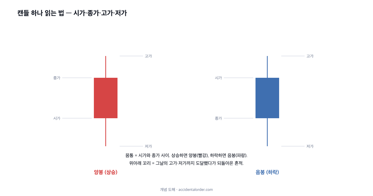
A single candle holds four prices for a given period (a day gives a daily candle, a week a weekly candle). They are the open, the first price traded in that period, the close, the last price, the high, the highest reached, and the low, the lowest. A candle is these four numbers drawn as one bar.
A candle consists of a body and tails. The body is the rectangular part between the open and the close, showing where the price began and where it ended in that period. The thin lines extending above and below the body are the tails (or wicks), the traces of a move up to the high and down to the low and back again. A long upper tail means the price went up and was pushed back down; a long lower tail means it fell away and was bought back up.
Up-candles and down-candles — what the colours mean
If the close is above the open (the price rose in that period), it is an up-candle; if below, a down-candle. By convention, Korean market charts colour up-candles red and down-candles blue. Western charts often do the reverse, using green for rises and red for falls, so with an unfamiliar chart it is worth checking the definition of the colours first.
Reading colour and body size together gives you the “mood” of the day. A red candle with a long body is a day that rose strongly from the open to the close, while a candle with long tails above and below and a short body is a day when buying and selling were evenly matched and no direction was settled. But keep constantly in mind that this is only “a summary of what happened that day,” not a signal foretelling the next one.
Volume — the weight behind a price move
The volume bars beneath the candles show how many shares changed hands in that period. Volume gives “weight” to a price move. Even for the same 5% rise, a rise on ten times the usual volume and a rise on almost no trading mean different things. A price made with many people actually taking part carries more information than one made in a handful of trades.
In practice, therefore, price and volume are always read together. A rise or fall carried on volume means market attention has concentrated, while a move without volume may be a shallow wobble that can be reversed at any time. There is a trap here too, however. Whether a surge in volume means “buying is strong” or “someone is selling out in size” cannot be known from the volume figure alone. Volume tells you the size of the attention; it does not guarantee its direction.
Real figures — Monami’s surge and the explosion in volume
Take an actual case. Below are the daily candles and volume for the stationery company Monami over June and July 2026 (KRX). It is an episode in which “supportive buying” piled into a stock whose market capitalisation had fallen close to the delisting threshold.
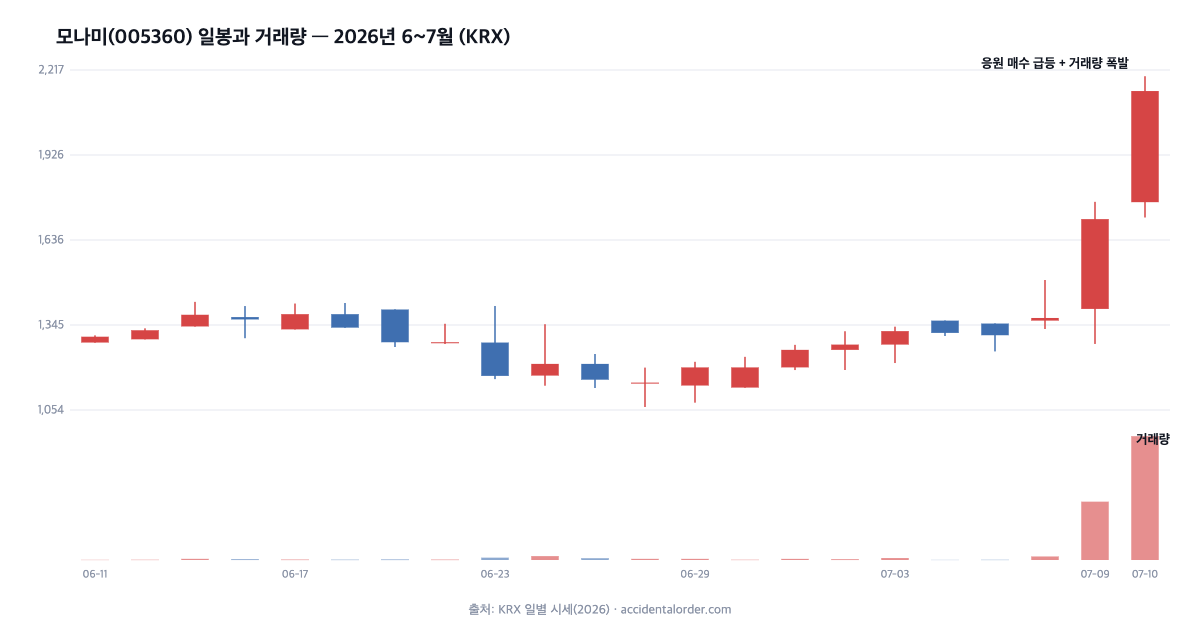
Up to early July, Monami drifted along in short-bodied candles and low volume. Then, on 9 and 10 July, large-bodied red up-candles came one after another and the close jumped from the KRW 1,300s to KRW 2,145, while volume exploded to dozens of times its usual level (volume of about 8.42 million shares on the 10th). From the candles and volume alone, the fact that “market attention concentrated explosively on those days” can clearly be read. The background to the episode — the raising of the market-capitalisation threshold for delisting, and the supportive buying by retail investors trying to prevent it — connects with the structure covered in the stock analysis.
But that is exactly as far as it goes. Was this explosive volume and surge a signal that “it will keep rising,” or a signal that “this is short-term overheating and will soon cool”? Candles and volume in themselves cannot answer that question. The identical combination of a surge and an explosion in volume marked the start of a trend in some stocks and the top in others. A chart shows what happened; it does not tell you what will happen.
The period of a candle — daily, weekly, monthly, intraday
The period a single candle covers depends on the chart settings. Drawing one candle per day gives daily candles, per week weekly candles, per month monthly candles, and per few minutes minute candles. Even for the same stock, the impression changes completely with the candle period you use. What looks violently choppy on minute candles may be a gentle drift on monthly ones.
When looking at a chart, then, you must always be conscious of “which period of candle am I looking at?” For a long-term investor, the churn of minute candles is mostly noise. The shorter the candle, the larger the random variation; the longer the candle, the more the big flow shows through. The longer your investment horizon, the more sense it makes to work from longer candles — that is how you avoid being tossed about by short-term noise.
Why the open and the close are special
Of the four numbers, the close is treated as particularly important, because it is the price the market finally agreed on after all the day’s information and sentiment had been absorbed. The intraday high and low may be values that spiked on a momentary burst of excitement or fear, but the close is closer to a conclusion agreed by the participants still there at the end of the day. It is why many indicators and moving averages are calculated from the close.
Reading the relationship between the open and the close alongside the length of the tails gives you the day’s “story.” A candle with a long lower tail that closed near the top says “it fell sharply during the session but buyers came in and pulled it back,” while a candle with a long upper tail that closed near the bottom says “it rose sharply during the session but was pushed back by sellers.” This “story” is only the narrative of a day that has passed, though — not a script for tomorrow.
Volume and liquidity — the trap in overlooked stocks
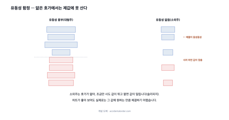
Volume is directly tied to a stock’s liquidity. A stock with consistently heavy volume is easy to buy and sell in the quantity you want when you want, whereas in a thinly traded stock the price jumps when you try to buy and slips when you try to sell, making it hard to execute at a fair price. This liquidity trap is especially large in overlooked small caps with small market capitalisations and little trading. There are stocks that look fine on the chart but where in practice buying just a few million won’s worth sends the quote leaping.
Volume is therefore also a practical gauge of “can I actually trade this stock?” However good the analysis, without liquidity the costs of entry and exit are large. This risk has to be read alongside volatility and maximum drawdown, and connects directly with the question of “a size you can bear” covered in investment risk. The thinner the stock, the smaller the position you should take at one time.
Price is not information but agreement
Step back a pace and the price printed on a candle is not “the company’s true value” but “the value agreed at that moment between someone wanting to buy and someone wanting to sell.” Mixed into that agreement is not only information such as earnings and news but also sentiment — expectation, fear, fashion. Price therefore sometimes departs far from value, and, as in Monami’s case, sentiment unrelated to earnings, such as “supportive buying,” can dominate the short-term price.
There is a view that the market is broadly efficient and most information is already reflected in the price, and a view that sentiment throws it off frequently. Either way, what is clear is that a single candle does not contain “the right answer.” A candle is a record of an agreement, and agreements can be wrong. Rather than treating the chart as an oracle, it is safer to hold the anchor of the business and its finances alongside. How to read that anchor was covered in how to read financial statements.
Candle patterns — know them, but do not put your faith in them
Names given to the shapes formed by several candles are candle patterns. They include the “doji,” with no body and only long tails, the “hammer,” with a long lower tail, and the “engulfing” pattern, where a large up-candle swallows the down-candle before it. Such patterns compress the tug-of-war between buyers and sellers at that moment, so they are useful as a language for describing market conditions.
The problem is that these patterns are commonly sold as predictive tools, in the form “when this pattern appears the price rises/falls.” From here on, caution is required. Claims that a particular candle pattern reliably predicts future returns generally fail to replicate under rigorous statistical testing.
What this article does not say
This article does not say that “a particular candle pattern or volume signal predicts future prices.” Assertions of the kind “a hammer means a rebound” or “an explosion in volume means a further rise” rest on weak evidence. In the majority of academic studies, the predictive power of individual candle patterns disappeared once transaction costs were taken into account, or failed to replicate. Candles and volume are tools for summarising the past and describing the present situation, not signals that predict the future. This site uses charts only as “a language for reading the record,” never as prophecy.
So what are candles and volume good for?
If they are not predictive tools, why learn them? They have three practical uses. First, grasping context. They compress into a single view whether a stock is quiet or overheated at present, and whether trading is behind the move. Second, as a tool of execution. When actually trading a stock you have decided to buy on fundamentals, they help with judgements about execution and liquidity, such as avoiding stretches of thin volume. Third, as a language of communication. Expressions such as “a long upper tail” or “a rise without volume” let market conditions be shared concisely.
The key is the order. From this site’s perspective, the skeleton of an investment judgement is the financial statements and an understanding of the business (fundamentals), while candles and volume are supporting tools for executing that judgement and reading the context. The chart does not make the decision; it helps you carry out a decision already made.
A few candle shapes you will often see
There is no need to memorise the names, but a few frequently seen shapes are convenient for describing a situation. A long up-candle is a red candle with a very long body, a day that rose strongly from the open to the close. Monami’s candle on 10 July is an example. A doji is a candle whose open and close are almost identical, so the body is as thin as a line, representing a state in which buyers and sellers are evenly matched and no direction has been settled.
A hammer is a shape with a long lower tail and a small body near the top — a day that fell sharply during the session and came back. Conversely, the inverted hammer or shooting star is a shape with a long upper tail, a day that rose and was pushed back. These shapes compress the day’s tug-of-war into a picture. To stress it again, these shapes only describe “how that day went”; they do not prophesy “what will happen tomorrow.” The same hammer marked the start of a rebound on some days and a brief pause on others.
How the open and the close are set — the call auction
In the Korean market, the open and the close are set not by ordinary continuous trading but by a call auction (dongsihoga). Orders are gathered over a set period before the open (08:30–09:00) and before the close (15:20–15:30), and are then executed all at once at the single price at which the largest volume trades. The open and the close are therefore prices in which supply and demand at that moment are condensed, and are relatively more representative.
Knowing this structure makes it clear why the close is treated as especially important. The close is the single price agreed by the largest number of participants at the end of the day, so it is more reliable than intraday highs and lows that spiked momentarily. It is why many indicators are calculated from the close, and why the market’s “final answer” to an earnings release or a news item is read from the close.
Three common illusions when looking at charts
First, hindsight bias. Looking at a chart that has already risen, the signal saying “I should have bought here” appears obvious, but at the time that signal was indistinguishable from countless other similar shapes. It is the illusion by which every pattern looks clear once you know the outcome. Second, selective memory. Cases where a pattern worked are remembered vividly and cases where it failed are forgotten, producing the mistaken belief that “this pattern works well.” Third, drawing pictures. Ruling lines on a chart that has already happened and finding patterns is easy, but judging in real time at the right-hand edge is an entirely different problem. The left side of the chart (the past) is clear; the right side (the future) is always in fog.
What these three illusions have in common is that they make a chart look more predictive than it really is. An evidence-based attitude therefore begins with coolly separating what can be read from a chart (the record of the past, the context of the present) from what cannot (the direction of the future).
How to read volume a little more accurately
Volume should be read “relative to normal” rather than in absolute figures. How many times today is relative to the stock’s recent average volume matters more than the figure of 1 million shares in itself, because 1 million shares in a large cap and 1 million shares in a small cap are entirely different events. That is why many charts draw a moving average over the volume bars, so that whether today’s volume is above or below normal can be seen at a glance.
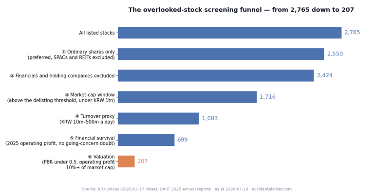
Another useful concept is traded value. It is volume (the number of shares) multiplied by price, showing how much money actually changed hands. A low-priced stock can have heavy volume but small traded value, so traded value is a more accurate gauge of liquidity than volume. It is the same reason our screener uses the 60-trading-day average traded value, rather than volume, when defining overlooked stocks.
A checklist for reading candles and volume
- Check the candle period: is this a daily or a minute candle, and does it match my investment horizon?
- Check the colour convention: is a rise red, or green?
- Body and tails: was this a day that settled a direction, or a day of even balance?
- Volume relative to normal: was attention behind the move (measured by traded value)?
- Context, not prediction: read only what happened, and draw no conclusions about the future.
To add a thought: treating a chart as a “language” rather than a “prophecy” is actually liberating. Freed from the pressure to guess right, you can calmly read what state a stock is in now and leave the judgement to the business and the finances. The chart is only the stage on which that judgement is carried out; it cannot stand in for the judgement itself.
Frequently asked questions (FAQ)
Q1. Is red a rise and blue a fall?
That is the convention on Korean charts (up-candles red, down-candles blue). Western platforms and some apps, however, show rises in green and falls in red. It is safer to make a habit of checking the colour convention whenever you look at a chart.
Q2. Is an explosion in volume a good signal?
A surge in volume tells you only that “attention has concentrated”; it does not guarantee the direction (whether buyers or sellers have the upper hand). Heavy trading may be strong buying, or it may be heavy selling — someone’s exit. Direction must not be concluded from volume alone.
Q3. Can I trade on candle patterns alone?
Not recommended. The predictive power of individual candle patterns is statistically weak. This site’s view is to use candles and volume as supporting tools for context and execution, and to begin the judgement of what to buy from the business and the finances (fundamentals).
In summary
A candle summarises four numbers — open, close, high and low — in a single bar, and volume tells you the weight behind the move. Read together, they compress “what happened during that period” into a single view. But candles and volume are a record of the past, not a signal about the future. Using these tools as a language of context and execution rather than of prediction is the attitude that fits the evidence. The next article deals with trends and moving averages, which read several candles in sequence. It will look at why the moving average is a useful summarising tool, and at how conventional beliefs such as “a golden cross means the price rises” are assessed against actual evidence — again separating evidence from superstition with a cool head.
Investing study · technical analysis. This article is for information only and is not a recommendation to buy or sell any particular stock. Prices are based on public KRX data and may change after the time of writing (July 2026).