Trends and Moving Averages: Reading the Flow Without Mistaking It for a Signal
If a single candle is the story of one day, stringing many candles together reveals a trend: whether prices are broadly rising, broadly falling, or crawling sideways. Daily prices are jagged, though, which makes a trend hard to catch by eye. The classic tool for filtering out that jaggedness — the noise — and leaving only the flow is the moving average. This article covers what a moving average is and how it is used, and separates out how received wisdom such as “a golden cross means the price will rise” holds up against the actual evidence.
What is a moving average?
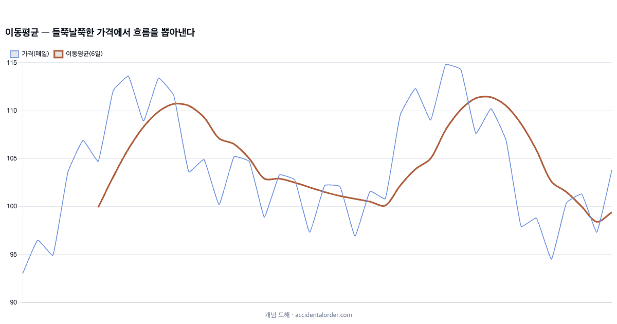
A moving average is the average closing price over a recent fixed period. A 20-day moving average is “the average of the closing prices over the most recent 20 days including today”, and as each day passes the oldest day is dropped and the new day added before the average is taken again. The value therefore “moves” a little every day. Averaging in this way offsets one-day spikes and drops, producing a curve far smoother than the jagged price line.
The use of that smooth curve is plain. Because the moving average is not much shaken even if today’s price jumps, it shows at a glance the broad flow — “is this stock broadly in a rising phase or a falling one?” In the diagram above the thin line (daily price) heaves about while the thick line (the moving average) calmly traces only the flow. Let us be clear from the outset that a moving average is not a forecasting device but a lagging indicator that summarises the flow of prices already past.
There is a good exercise for anyone using moving averages for the first time. Lay a single 60-week line over the weekly chart of a stock you follow, and check nothing but the slope of that line once a month. Sloping up is a rising phase, sloping down a falling phase, flat a sideways phase. This simple habit alone is enough to keep you from being tossed about by daily spikes while not losing sight of the broad flow. Before adding indicators, read one of them properly first.
Short, medium and long — the period sets the character
A moving average changes character with the number of days averaged. A short period (say 5 or 20 days) reacts sensitively to price and follows turns in direction quickly, but it also picks up a great deal of residual noise. A long period (say 60 or 120 days) moves sluggishly and shows only the broad flow, but reflects turns late. So a short line represents “the recent mood” and a long line “the big direction”.
In practice, moving averages of several periods are overlaid together. A state in which the shorter lines are stacked neatly above the longer ones is called bullish alignment, and generally indicates an uptrend. Conversely, bearish alignment, with the shorter lines lying beneath the longer ones, is associated with a downtrend. But this “alignment” is a summary of the flow up to now; it does not guarantee the direction ahead.
The trend — rising, falling, or crawling
There are broadly three trends: an uptrend, in which lows and highs rise together; a downtrend, in which they fall together; and a sideways phase, in which prices move up and down within a fixed range. The slope and alignment of moving averages let you gauge which phase the present most resembles. Moving averages sloping up in bullish alignment mean a rising phase; sloping down in bearish alignment, a falling phase; tangled with no direction, a sideways phase.
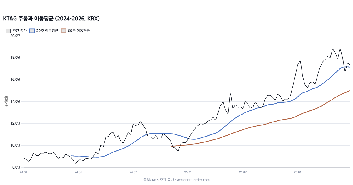
Take an actual case. Above are KT&G’s weekly candles from 2024 to 2026 with the 20-week and 60-week moving averages (KRX). As the share price began to rise from the middle of 2024, the 20-week line climbed above the 60-week line, after which the two moving averages ran up together in bullish alignment. The picture summarises smoothly the fact that “KT&G was in an uptrend over this period”. To stress the point again, though, this is a summary of a flow that has passed. The moment you read that alignment as “so it will go on rising”, a summarising tool has been recast as an oracle.
Simple and exponential moving averages
Moving averages come in types. The most basic is the simple moving average (SMA), which averages the closing prices of recent days at equal weight, treating the value from 20 days ago and yesterday’s value alike. The exponential moving average (EMA), by contrast, places greater weight on recent values and so responds more sensitively to changes in price. An EMA therefore follows turns in direction a little faster than an SMA, but picks up correspondingly more residual noise.
It is hard to declare either one better. React sensitively and you catch turns early but at the cost of more false moves; react sluggishly and false moves fall away but you are late. This trade-off is an intrinsic limit of the moving average. There is no magic setting, of any type or period, that is “fast and accurate at the same time”. Knowing this keeps you from being swayed by claims that some particular setting works especially well.
Why moving averages look like support and resistance
Looking at a chart, prices often seem to stop or turn back near a particular moving average. This is not because the moving average holds any magic, but because many participants take the same moving average as a psychological reference. If many people believe “it finds support at the 120-day line” and buy around that level, buying interest genuinely forms there. It has a self-fulfilling quality.
Support and resistance at a moving average are therefore not “a law of physics” but “the trace of crowd psychology”. When participants’ attention moves elsewhere, that force disappears too. Trading as though a moving average were an absolute wall can lead to large losses the moment the belief breaks. Support and resistance themselves are covered in more detail in the next article.
When does a trend end? The trap in the judgement
The hardest part of trend analysis is judging in real time “is the trend still alive, or has it already broken?” On a chart of the past, the beginning and end of a trend look distinct, but at the right-hand edge — the present — a brief correction cannot be told apart from a turn in the trend. Even when a moving average rolls over, whether that is a temporary pullback or a genuine turn down can only be known once more time has passed.
Because of this uncertainty, trend following inevitably carries the cost of “getting on late and getting off late”. Wait to confirm the trend before entering and you miss the start; wait to confirm the turn before leaving and you are already past the high. This cost of delay cannot be avoided so long as the moving average is a lagging indicator. So even when using trend tools, it has to go hand in hand with not staking a large amount on any one stock and instead spreading positions across a size you can bear, so as to lessen the blow when the judgement is wrong.
Disparity — how far from the moving average?
The disparity ratio expresses as a percentage how far the price sits from its moving average. A price far above the moving average (a large disparity) is sometimes read as short-term overheating, and one far below it as short-term oversold. It is the intuition of “mean reversion”: stretch a rubber band too far and at some point it snaps back to the average.
The intuition is plausible, but the disparity ratio too is weak as a predictive signal. In a strong trend the gap can stay wide for a long time, and judging the market overheated and betting the other way often means being buried by the trend. The disparity ratio tells you only the state — “it is stretched a long way in the short term” — and guarantees nothing about “it will soon come back”.
Golden crosses and dead crosses
A shorter moving average breaking up through a longer one from below is called a golden cross, and crossing down through it from above a dead cross. The golden cross is commonly introduced as a buy signal and the dead cross as a sell signal. The names are dramatic and they stand out on a chart, which makes them the most popular “signal” among beginners.
Here, though, caution is required. Because a moving average is a lagging indicator, a cross appears only after prices have already risen or fallen considerably. By the time a cross shows up, in other words, the start of the trend has often long gone. In a sideways stretch, moreover, crosses occur repeatedly at short intervals (false moves, or whipsaws), and trading each one merely piles up transaction costs.
What this article does not say
This article does not say that “a golden cross means the price rises and a dead cross means it falls”. Strategies that apply simple moving-average crossover signals directly to individual stocks often fail to produce stable excess returns because of lag, frequent false moves and transaction costs, and they frequently vanish under rigorous testing. For reference, “the tendency for a price trend to persist for a while” — momentum — has itself been observed across various markets and periods and is discussed in the academic literature, but that discussion presupposes a diversified portfolio with strict rules and cost control, and is a different matter from a simple “buy on the golden cross” signal. A moving average is a tool that summarises a trend, not a signalling device that tells you when to trade.
So what are moving averages for?
If not for prediction, what use is a moving average? First, summarising the trend. It compresses into one line whether this stock is, in the big picture, in a rising or a falling phase. Second, as a reference line. Because many participants take a particular moving average (the 120-day line, say) as a psychological reference, buying and selling are sometimes observed to cluster around it. Third, as a noise filter. It lets a long-term investor see only the broad flow instead of being shaken by daily spikes and drops.
The key point is the same as in the article on candles. Moving averages and trends are contextual tools for reading “what phase are we in now”, not instructions on “when to buy and sell”. The judgement of what to buy still begins with the business and the financials. Pick good companies through the financial statements, then use trends and moving averages as an aid to understanding the current phase of those stocks — that is the order the evidence supports.
Momentum — the background to trend following, and its limits
“The tendency for what has been rising to keep rising for a while” is called momentum. Interestingly, this phenomenon has been observed repeatedly across many countries, asset classes and long periods, and has been discussed seriously in academic work. So flatly declaring that “trends are pure superstition” would not be accurate. There is an important premise, however. The momentum confirmed academically is a story about systematic strategies that hold numerous stocks in a regular, diversified way, buy and sell mechanically according to set rules, and manage transaction costs strictly.
This is something entirely different from an individual looking at the chart of one or two stocks and deciding “it’s a golden cross, so buy”. Simple signals on individual stocks rest on a small sample and admit emotion, leaving them far from the statistical edge of academic momentum. And even that slender edge disappears easily in the face of transaction costs and taxes. The honest conclusion, then, is this: the tendency for trends to persist is real, but it is extremely difficult for an individual to monetise it stably through signals on individual stocks. The existence of a tool and the practicality of a tool are separate questions.
Why people are drawn to trend signals
Moving-average crossovers and trend lines are unusually attractive to beginners. The rules are simple (“buy when it breaks this line”), they are clearly visible on a chart, and applied to past charts they feel astonishingly accurate. But that “feeling of fitting the past well” is the trap. Drawing lines on a chart of the past when you already know the answer is nothing like judging in real time in the fog at the right-hand edge. Selective memory — remembering the cases that worked and forgetting those that missed — further inflates the illusion.
An evidence-based attitude keeps its distance from that attraction. The simpler and more vivid a signal’s appeal, the more coolly one has to ask “does it really predict the future, or does it merely explain the past well?” This is why this track teaches the tools in detail while continuing to point out their limits.
Charts and fundamentals — a question of order
Should trends and moving averages be ignored altogether, then? No. It is a question of order. From this site’s perspective, the judgement of “what to buy” begins with the business and the financials. Having picked good companies through the financial statements, we then use trends and moving averages as an aid to understanding the current phase of those stocks (rising, falling or sideways) and to refining execution. The chart, in other words, is not the master that makes the decision but a tool that helps execute a decision already made.
If the order is inverted and the chart becomes the starting point of judgement, you end up entrusting your assets to signals with weak foundations. We reached the same conclusion in candlesticks and volume. Tools are useful, but keeping to the boundary between what a tool can and cannot do — that is the consistent attitude of this track.
Drawing trend lines — convenient but subjective
Often used alongside moving averages is the hand-drawn trend line: joining the lows in a rising phase to draw a line beneath the price, and joining the highs in a falling phase to draw one above it. A trend line is a convenient tool for organising the flow visually, but it has a decisive weakness — the subjectivity whereby the line changes depending on which points you join.
Given the same chart, different people can draw different trend lines, and one person can even pick the “best-fitting” line after learning the outcome. So the judgement that a trend line “held” or “broke” is not as objective as it looks. A trend line is useful as a sketch for organising the flow, but too flimsy a foundation on which to build trading rules. Where the moving average is at least better than the trend line is that its calculation rule is explicit, so less subjectivity enters.
Derived indicators are, in the end, reprocessed price
Various derived indicators emerge from the moving average, such as Bollinger Bands and MACD. Bollinger Bands wrap a band of the width of volatility above and below a moving average, while MACD looks at the difference between two different exponential moving averages. We will take these one at a time in later articles, but there is one thing to remember in advance: all of these indicators are ultimately different reprocessings of a single raw material called price.
Overlaying several indicators therefore does not increase the information by as much. Most of them merely repeat the same price information in a different manner. The more indicators there are, the easier it is to fall into the illusion that “several pieces of evidence agree”, when in reality they are often the echo of one piece. What matters is not the number of indicators but knowing what each of them says and what it cannot say.
A checklist for reading moving averages and trends
- Match the period to your horizon: for long-term investing, use long moving averages for the broad flow.
- Alignment and slope: bullish alignment sloping up, bearish alignment sloping down, or a tangled sideways phase?
- Remember the lag: a cross comes after the move has already happened.
- Beware false moves: in a sideways market, crossover signals miss frequently.
- Keep the order: decide what to buy from the financials, and use moving averages as an aid to understanding the phase.
Frequently asked questions (FAQ)
Q1. How many days should the moving average cover?
It should match your investment horizon. Long-term investors read the broad flow with long moving averages such as 60 or 120 days, while short-term traders watch short ones such as 5 or 20 days. There is no correct number, and the evidence that any particular period works especially well is weak.
Q2. Is it wrong to buy on a golden cross?
It is not that you must not buy; it is that buying “because it is a golden cross” rests on weak grounds. A moving average is a lagging indicator, so crosses appear late, and in a sideways market false moves are frequent. It is safer to start the buying judgement from the business and the financials, and to use moving averages as an aid to understanding the phase.
Q3. Is trend following useless, then?
Not at all. The momentum phenomenon, in which a price trend persists for a while, has been observed academically. But that is a story about systematic strategies premised on a diversified portfolio, strict rules and cost control, and is different from a simple crossover signal on an individual stock. It is not easy for an individual to follow by instinct.
Summing up
A moving average is a lagging indicator that draws only the flow out of a jagged price series and summarises a trend smoothly. The alignment and slope of short and long lines let you gauge whether the phase is rising, falling or sideways. Crossover signals such as the golden cross stand out, but because of lag and false moves they carry no predictive power in themselves. Using moving averages and trends to read the phase rather than to predict is what the evidence supports. The next article covers the places where prices often stop or turn back — support and resistance. There too we will separate the received wisdom that “a particular price level determines the future” from the cooler reading that it is “merely a level the crowd remembers”.
Investment study · technical analysis. This article is provided for information purposes and is not a recommendation to buy or sell any particular stock. Prices are based on publicly available KRX data and may change after the time of writing (July 2026).